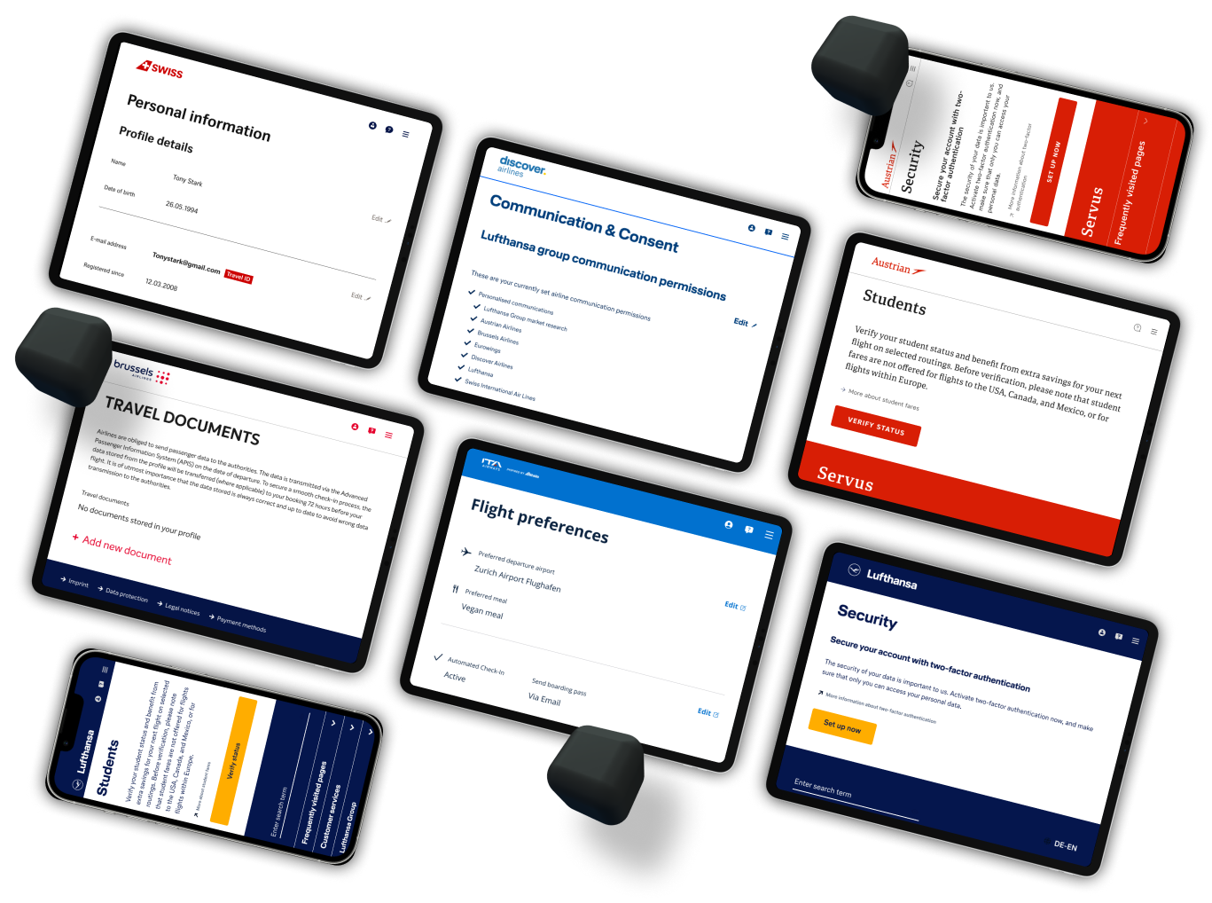
Led the Profile Page redesign for boosting user engagement and define the page design governance cross teams.
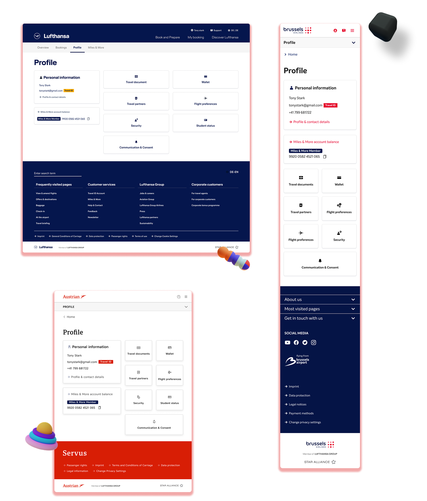
Drove the end-to-end redesign of the Profile Page for web in collaboration with Business Analysts, Developers, UX Researchers, and stakeholders, with the 2 objectives: Create a design for defining a governance structure for multiple teams involved in the profile experience and increasing user profile page engagement. The launch resulted in a 114% engagement increase within the first 2 months post-release.
RolE
Design lead
UX/UI designer
Information architecture
Prototyping
User Testing
Timeline
From Aug 2024
To Feb 2025
Product details
Account settings page
Logged-in experience
Web
B2C
Problem & Context
What problem was I solving?
1. The page was unreadable and lacked visual hierarchy
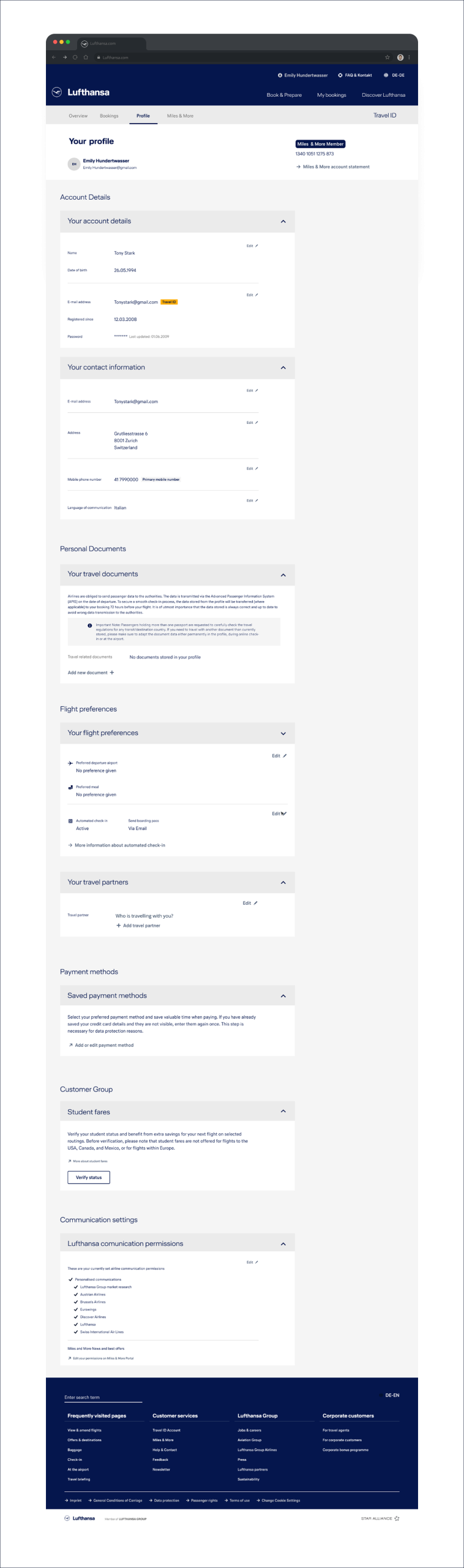
All sections were expanded by default, creating an extremely long page with no sense of priority or structure. Click-tracking revealed that users repeatedly opened and closed sections just to locate basic information. This behavior signaled:
High cognitive load
Difficulty scanning content
User frustration and frequent abandonment
3. No governance structure for multiple teams
With many teams competing for visibility on a single page, content became overloaded and inconsistent. There was no framework to:
Define what deserved priority
Ensure fair exposure across product areas
Maintain clarity for users
The result was a page that served internal team priorities rather than user needs.
2. Rigid templates limited product teams
To maintain consistency, all teams were forced to use the same UI template—even when their product needs were different. This led to:
Low engagement with key services
Reduced clarity of each product’s value
Difficulty for PMs to justify future investment
4. The page was not tracking user’s functionalities preferences, just as whole page
The old Profile Page displayed all features on one long page, which meant Google Analytics tracked everything as a single view. We couldn’t see which features users actually interacted with, preventing teams from making data-driven decisions or understanding user needs.
Our Profile Page was slowly turning into a giant FAQ-like page; every team that wanted visibility assumed they could just add another collapsible, doing so without considering the impact on the user. Over time, the page became overwhelmingly long, making it difficult to scroll through the sections and hard for users to find what they needed.
Channel Manager
Analytics and pain points
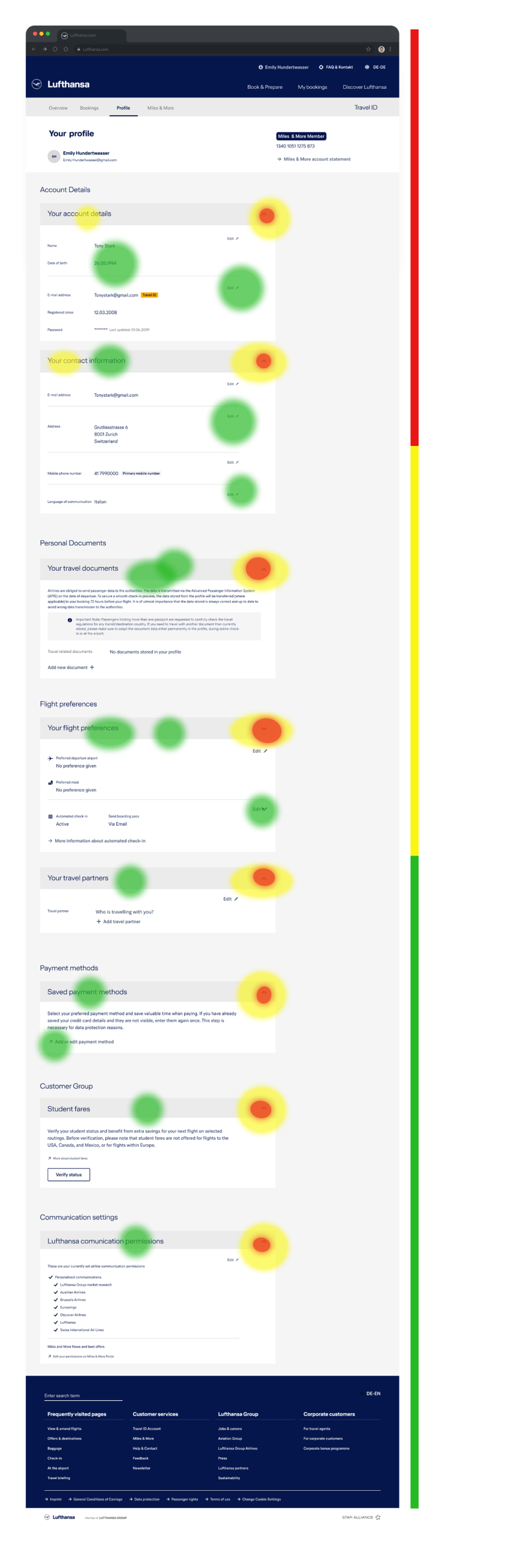
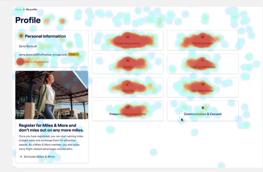
A heatmap I requested to data analyst showed users mostly were clicking arrows or titles to hide unnecessary page information, while interaction with the actual profile management functionalities remained low. It also highlighted a visibility imbalance between the top and bottom features of the page, confirming the need to simplify and rebalance the page hierarchy.
(Me) Estefano – Senior UX UI Desginer
Business and user problem statement
user problem
“I dont find what I need…”
The profile page was the entry point for creating a personalized travel experiences from saved data from traveler’s, documents, payment methods, loyalty preferences, and more , the lack of profile page easy navigation created:
Poor hierarchy and structure made it hard for users to find or manage key profile details like travelers, documents, and payment methods.
This created friction during trip prep and booking, reducing trust in how personal data was handled.
The outdated experience blocked users from having the smooth, personalized journey aligned with Lufthansa Group’s vision.
Business problem
“We are loosing the team founding”
The Profile Page was a key strategic investment because it connected multiple teams and services. When users didn’t engage with these services, it directly affected data quality, loyalty participation, and overall operational efficiency..
Perception of wasted investment for multiple teams like: payments, loyalty and profile.
Low loyalty engagement with the brand.
Reduced user personal details to personalize engaging capabilities
Design solution & Reasoning behind
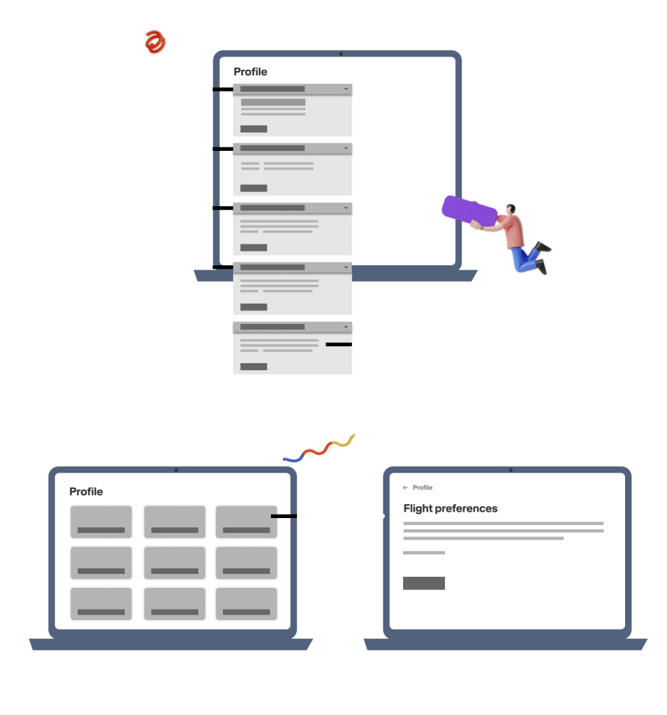
collapsibles into single buttons
I redesigned the UI by removing all collapsibles and converting every feature label into a clear, standalone button. This shifted the user’s focus to the feature titles, making it easier to scan the available options quickly. The result was a cleaner, shorter page that improved findability and reduced cognitive load.
New page functionality for ownership and tracking
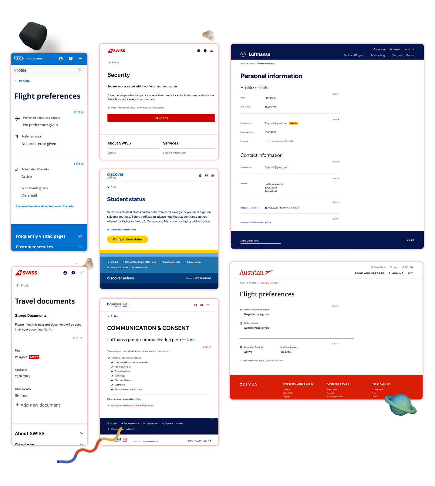
I moved all feature content out of the collapsibles and into dedicated child pages, giving each responsible team full ownership to shape their page according to their strategy. This shift also enabled proper tracking and measurement of each functionality independently, something the old single-page setup couldn’t support.
The new layout also made the Profile Page far more mobile-friendly. The old page became extremely long on mobile, making it hard for users to find or use key features. By simplifying the structure and moving content into child pages, the mobile experience became shorter, clearer, and much easier to navigate.
Internal challenge & new design impact
the internal challenge I faced with the teams
Users wanted to see less but teams wanted show more
One of the biggest challenges I faced in leading this project was during the workshops and my prototyping phase the product owners and business analysts often pushed me verbally to display more information of features in the profile page because they were worried that reducing information would lead to lower the traffic or visibility for their functionality, but I needed so always explain that showing less would increase their traffic to their functionality was it was going to be easy for the user to find the functionality firstly.
users were able to find what they needed easily
Teams got founding secured and users got engaged
The redesign had a strong and immediate impact. By hiding unnecessary details and showing only clear, scannable labels for each feature, users were able to find what they needed much faster. This led to an overall engagement increase of around 114% within just two months of launching the new Profile Page. Features that had previously gone unnoticed also gained significantly more visibility. For stakeholders, this was a clear indicator that these teams and their functionalities were valuable and deserving of continued investment.
My Role & Responsibilities
I was the project driver and singe point of contact
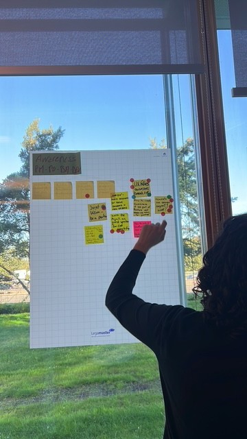
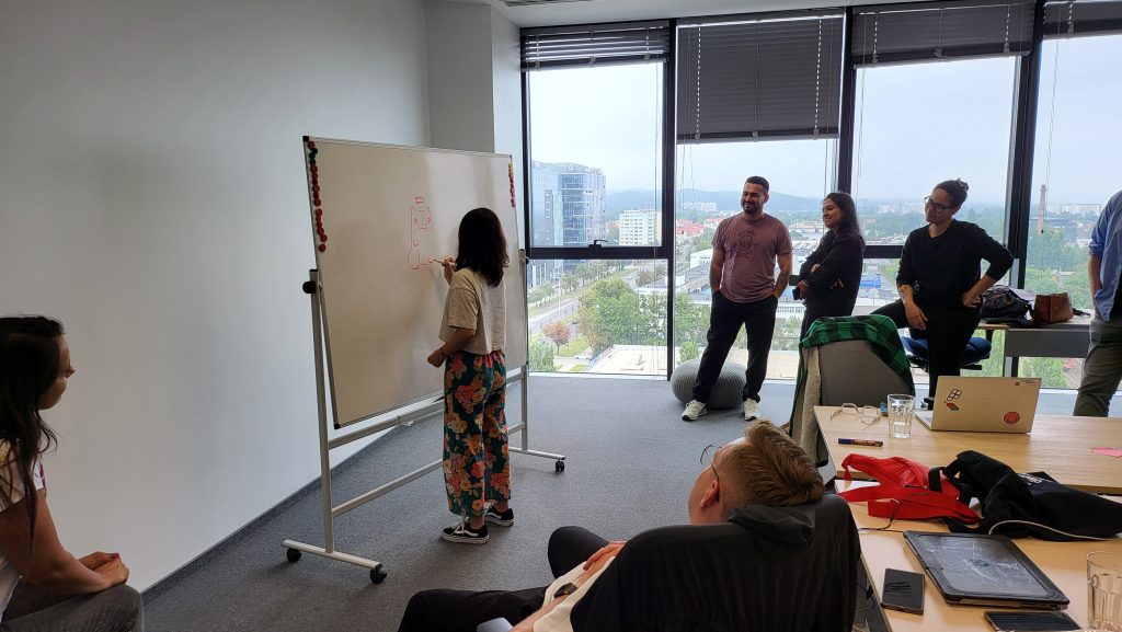
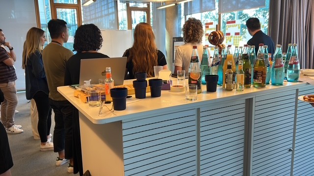
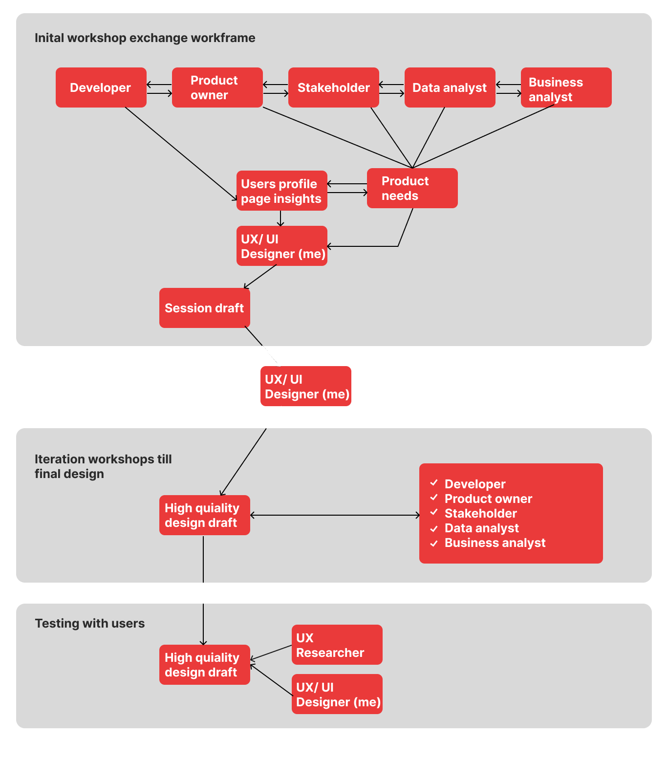
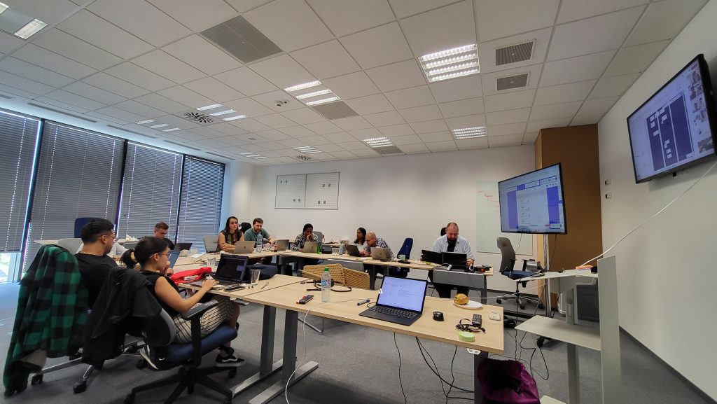
I led eight cross-functional workshops over seven months, some of them were online and other ones were in person. At the round table were with me the stakeholders, developers, business analyst and product owners, in these workshops my goals were:
Letting the stakeholder say openly to the teams their expectations and metrics they would count on.
Letting the front end developers mention their capabilities.
Drafting with Product owners the project plan and tasks.
Keeping the new design delivery date on track.
I defined the project workflow, strategic design thinking and met the product design needs
After each workshop, I gathered input from all teams, interpreted their capabilities, and translated their ideas into clear visual direction. I rapidly iterated on design drafts using the heat map insights, validating concepts with the team as we progressed. After every session, I delivered updated designs and scheduled the next workshop to drive fast alignment and confident decision-making.
I made and validated the prototypes with the project member on every workshop till the final design
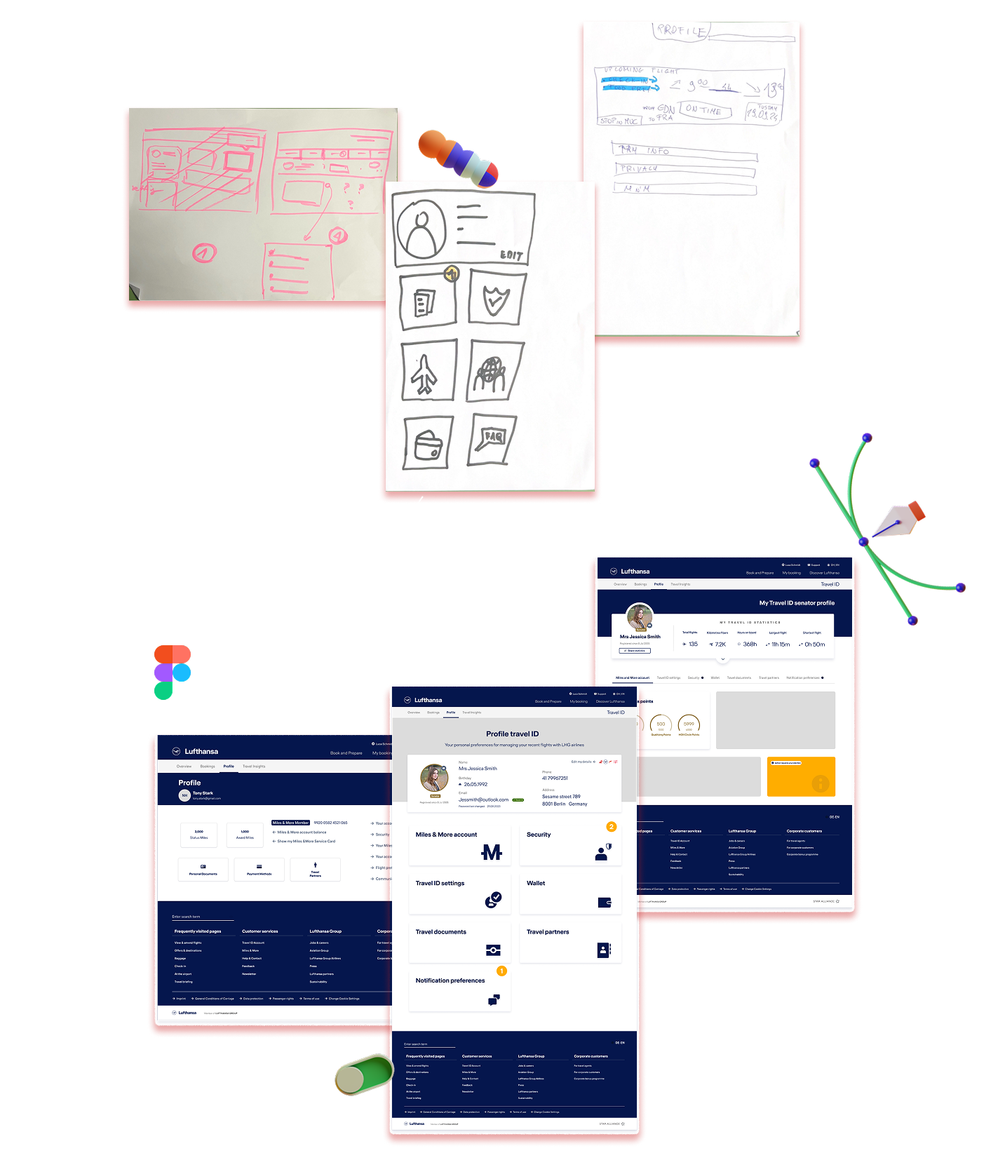
After each workshop session, I was responsible for designing the Profile Page in line with our workshop conclusions. I created designs starting from initial paper sketches all the way to the final high-fidelity versions ready for user testing. Every iteration was carefully developed and saved in Figma, creating a complete historical record of the project’s evolution.
co-created the research plan and translated insights from testing into final design
I collaborated closely with the UX Researcher for two months, preparing the research plan, refining interview questions, and shaping the prototype for testing. Our main goal was to understand the following on the new profile design I made:
learn about the intuitiveness and usability of the new profile page.
understand users’ expectations toward cards and their content.
uncover users’ pain points in their experience with the profile page.
learn users’ ways to navigate between profile subpages.